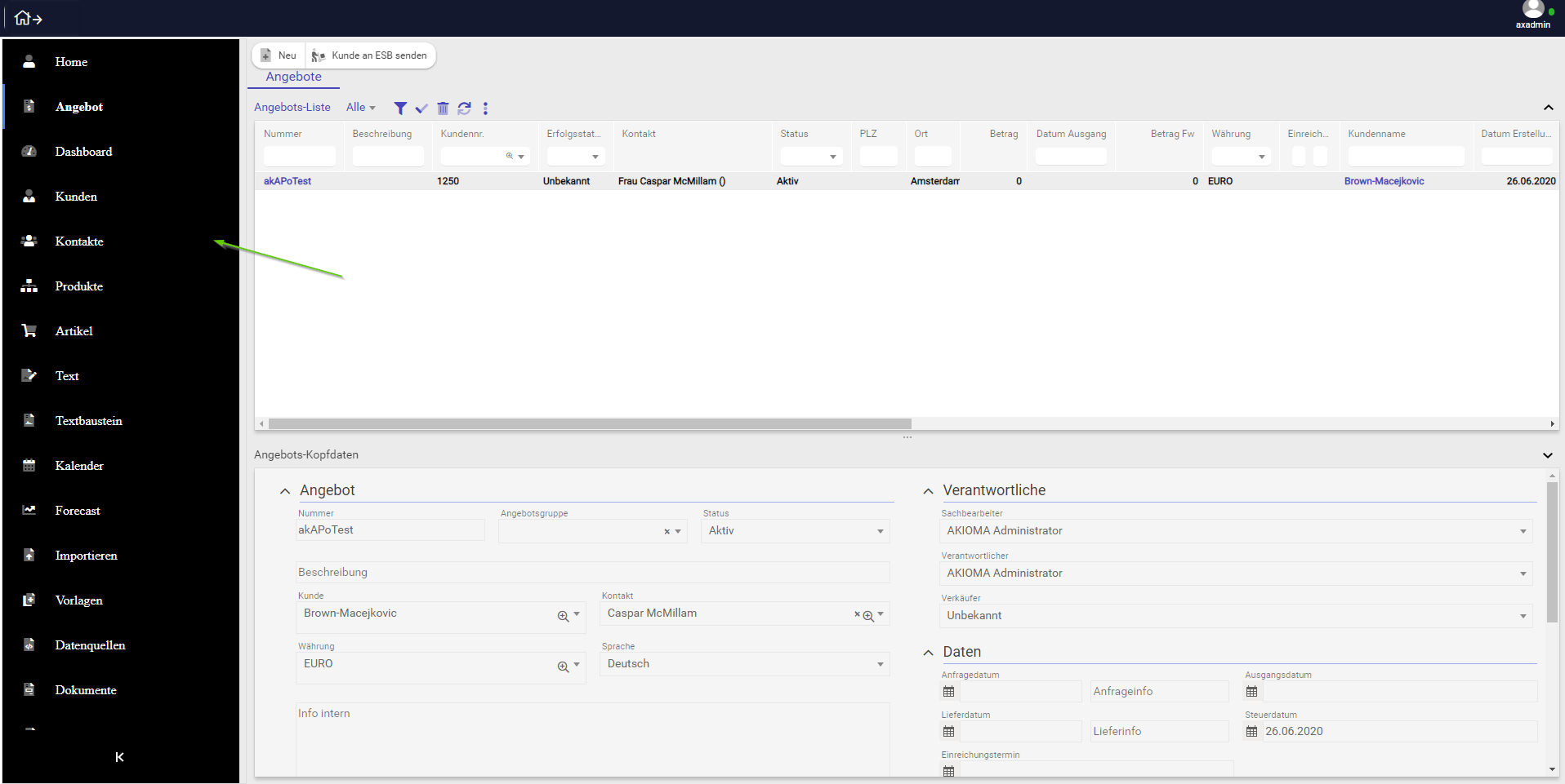
The Sidebar is a toggleable slide out box, which can be used for navigation, menus, details, etc.
A Sidebar is an object in the repository that can load items on n-levels with the nested items lazy loaded.
The Sidebar can also be collapsed or expanded by clicking on the icon in the bottom area of the sidebar control.
For setting the menu structures to load inside the Sidebar object, the "menuStructure" attribute is available on the SwatSidebar level, where you can specify the name of the menu or a list of menus separated with a comma.
In the same Layout container, (Window or Frame) and in combination with a PanelSwitcher control, the Sidebar can load different content areas depending on the selected item.
By specifying an event listener in the "EventAfterTabSelected" attribute, the developer can write custom client logic in order to switch views in the PanelSwitcher control.
For eg EventAfterTabSelected: "$ akioma.onDesktopSidebarItemSelect(self);"
/**
 * Method executed on selection of sidebar to switch to the corresponding panel view in the panel switcher
 * @param {ak_sidebar} Sidebar Sidebar control
 */
akioma.onDesktopSidebarItemSelect = function(Sidebar) {
  const panelSwitcher = Sidebar.container.getFirstChildByType('panelSwitcher');
  const selectedItemAction = Sidebar.controller.event.selectedObj.Function;
  if (selectedItemAction)
    panelSwitcher.switchView(selectedItemAction.actionParameter);
  const options = { preventAction: true };
  return options;
};
Also by using the Sidebar "EventOnInitialize" attribute event, the developer can specify a custom client logic method in which he can set the menuStructure or a comma separated list of menus to load.
For eg EventOnInitialize: "$ akioma.buildMainLayoutTabsSidebar(self);"
/**
 * Method executed on initilize to retrieve the desktop menu structure items to be loaded as items in Sidebar
 * @param {ak_sidebar} Sidebar Sidebar control
 */
akioma.buildMainLayoutTabsSidebar = function(Sidebar) {
  Sidebar.controller.forceView = 'frame';
  return new Promise(resolve => {
    const oReturn = akioma.callServerMethod('Akioma/Swat/UiInteraction/getDesktops.p', [{ type: 'oCHAR', name: 'cDesktops' }]);
    Sidebar.controller.setMenu(oReturn.cDesktops);
    resolve();
  });
};
The menu(s) to load can be created from the Menu admin desktop screen.
Ribbons in Sidebar
It is also possible to load menus with blocks and separators inside sidebars, ribbon menus.
For it to work we need to also specify the menuStructure depth 2 for the initial loading. This can be achieved by setting the "menuStructure" attribute to something like: "rbOfferCompact:2",
where the first part is the name of the menu structure and the second part is the depth of menu. You can also load multiple menu structures like for example: "rbOfferCompact:2, rbOffermenu:2".
All styles customization can be done in normal CSS by using this classes
// AKIOMA Sidebar object

$sidebar_primary_color: #4285f4 !default;
$sidebar_base_bg: #2a2a2e !default;

$sidebar_item_color: #fff !default;

$sidebar_item_active_color: null !default;
$sidebar_item_active_bg: null !default;

$sidebar_item_open_color: #fff !default;
$sidebar_item_open_bg: $sidebar_primary_color !default;

$sidebar_item_hover_color: null !default;
$sidebar_item_hover_bg: rgba(darken($base-bg, 5%), 0.5) !default;

$sidebar_icon_color: null !default;
$sidebar_icon_bg: darken( $sidebar_base_bg, 5% ) !default;

$sidebar_icon_active_color: null !default;
$sidebar_icon_active_bg: null !default;

$sidebar_icon_open_color: null !default;
$sidebar_icon_open_bg: $sidebar_item_open_bg !default;

$sidebar_mobile_item_color: #fff !default;
$sidebar_mobile_item_bg: $sidebar_primary_color !default;
$sidebar_mobile_icon_color: $sidebar_mobile_item_color !default;
$sidebar_mobile_icon_bg: $sidebar_mobile_item_bg !default;

$sidebar_dropdown_bg: lighten( $sidebar_base_bg, 5% ) !default;
$sidebar_dropdown_color: null !default;

$sidebar_item_font_size: 16px !default;
$sidebar_item_line_height: 30px !default;
$sidebar_item_padding: 10px 15px !default;
$sidebar_icon_height: 35px !default;
$sidebar_icon_width: 35px !default;
.v-sidebar-menu {}
.v-sidebar-menu.vsm_expanded {}
.v-sidebar-menu.vsm_collapsed {}
.v-sidebar-menu.vsm_rtl {}
.v-sidebar-menu .vsm--item {}
.v-sidebar-menu .vsm--link {}
.v-sidebar-menu .vsm--link_active {}
.v-sidebar-menu .vsm--link_open {}
.v-sidebar-menu .vsm--link_mobile {}
.v-sidebar-menu .vsm--link_level-[n] {}
.v-sidebar-menu .vsm--link_disabled {}
.v-sidebar-menu .vsm--title {}
.v-sidebar-menu .vsm--icon {}
.v-sidebar-menu .vsm--arrow {}
.v-sidebar-menu .vsm--arrow_open {}
.v-sidebar-menu .vsm--badge {}
.v-sidebar-menu .vsm--badge_default {}
.v-sidebar-menu .vsm--header {}
.v-sidebar-menu .vsm--dropdown {}
.v-sidebar-menu .vsm--mobile-bg {}
.v-sidebar-menu .vsm--toggle-btn {}
You can access the Sidebar Tutorial to check how a new Desktop item can be added.
For full description of attributes and events of this object please access the Client-Logic API